


For inspiration with regards to the aesthetic of this advertising project, I looked at the work of well known photographer Helmut Newton. I wanted to complete some individual research as I felt this would improve my approach towards the work, ensuring I had plenty of ideas to bring to the table. Last year I purchased a book of Helmut Newton's Polaroids. This book is a collection of a careers worth of fashion Polaroids, some in colour and some in black and white. Although there is a mixture of on location and studio shots, the on location work really reflects my personal desires for this project. By looking into the work of Newton, I was able to understand further the importance of working on location and how this can improve the quality of fashion campaigns. It allows for a fresh perspective with regards to recognising cultural context and the importance of this within the fashion industry. Here are a few of the shots from Helmut Newton's Polaroid book.


During my initial research into various campaigns I was drawn to the aesthetic of the Miu Miu Autumn/Winter 2015 campaign shot by Steven Meisel as I thought the washed out lighting signified old 35mm photographs which mirror the vintage aesthetic of our Recycle and Reuse clothing.


Although I’m still drawn to this fashion campaign we agreed as a team that we should move away from styling the shoot to match a single decade as this would draw focus away from our campaign idea - which is to create imagery which is akin to high fashion advertisements seen today but uses second hand clothing instead of extremely expensive new clothing which is unattainable for many young people.
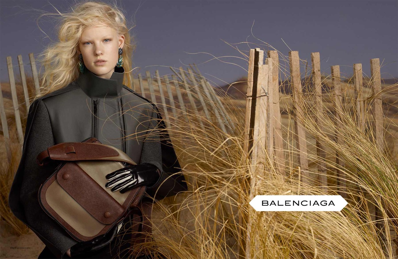
Through the Miu Miu campaign I researched more of Meisel’s work and discovered the Balenciaga campaign he shot for the Autumn/Winter 2012 season. I think the aesthetic of this shoot more closely matches the final look that as a group we are wanting to achieve.

Steven Meisel successfully casts models that are able to represent the story the fashion house wishes to portray through their current seasonal clothing. These stories not only reflect the brands vision but are also reflect current culture. I think this is an important element of creating a successful advertising campaign as viewers and consumers have to be able to see themselves wearing the clothing that is presented. We will take this into consideration when choosing locations for our final shoots.
Meisel has also created campaigns which have been highly controversial by juxtaposing fashion and politics. In the September 2006 issue of Italian Vogue Meisel experimented with the idea of restricted liberties in a post 9/11 America. The models portrayed terrorists and policemen. This caused a lot of controversy as the models were presented in violent poses where many saw them as being victimised. This caused a negative response from many feminists who was the role of the female models being undermined by a male.


He again pushed the boundaries of fashion photography in another issue of Italian Vogue in July 2008 where only black models were featured throughout the publications and the whole issue was shot by Meisel. The issue was a response to increasing criticism of racism within the fashion industry. When later asked about the issue Meisel said: "Obviously I feel that fashion is totally racist. The one thing that taking pictures allows you to do is occasionally make a larger statement. After seeing all the shows though I feel it was totally ineffective. I was curious—because it received a lot of publicity—whether it would have any effect on New York, London, Paris, or Milan, and I found that it did not. They still only had one token black girl, maybe two. It’s the same as it always was and that’s the sad thing for me.”


Through discovering Meisel’s work I have found a new appreciation for fashion and advertising photography as he is able to portray larger issues and comment on todays society while also creating beautiful and successful advertising campaigns for some of the most prestigious fashion brands in the world. Although I do not think it is appropriate for us to comment on social issues through this campaign I believe my new appreciation for the medium will help me be able to better contribute to a successful fashion advertising campaign.
When editing my final imagery I wanted to chose photographs that were all in a portrait orientation even though some of my favourite shots were landscape if these images were to be published as a fashion story in an editorial magazine this format would not be possible.
I drew inspiration when editing my photographs from a series of images by Michael Schwartz of Hailey Gates for Interview Online. Images below and article here.


I was drawn to the dark aesthetic and thought it would mirror the aesthetic of the model we used during our final shoot. I also thought that this aesthetic and editing style would allow me to mask some of the elements of the location that were distracting and to draw more focus back on to the model and the clothing.
I edited each image in the same way to create cohesion between the shots. I wanted my images to be comparable to current fashion advertisements and so I edited elements of the photographs including the models skin and I made details in the clothing and models face stand out more. I also added a vignette and an iris blur to draw the viewers eye to the models face and the clothing rather than the surrounding detail. By editing the images I was able to add signs to them which signify a high fashion advertising campaign.
LV


Above are my chosen final images from our final shoots for our advertising campaign. For my final images I chose photographs that had similar features, a close up portrait and longer body shot for each location, as I want these images to be featured in a similar style to that of a fashion story in a contemporary editorial magazine.
Here you can see the final edited versions of my photographs and below each is the corresponding raw image. Further details of how I decided to edit my final images can be found in the blog post 'Editing Final Images: Libby'
LV


Above are all of the images I shot during our final shoot for our advertising campaign. For our final imagery we shot at three different locations which represent three different activities, or daily events. These locations were a laundrette, a park for a picnic and a tennis court. We shot a different outfit at each location to show the variety of styles and clothing available in shops and markets selling Recycled and Reused clothing.
LV


